
Buried at the end of Mark Gurman’s high-profile Bloomberg report about future Apple product announcements is a tidbit that’s of enormous interest to anyone who loves using their iPad.
Apple’s next operating system update, iOS 13, will include… iPad-specific upgrades like a new home screen, the ability to tab through multiple versions of a single app like pages in a web browser, and improvements to file management.
That’s a lot of information distilled into a small paragraph, but what jumped out at me most is the idea that the iPad’s home screen—which has spent almost nine years using a spaced-out version of the iPhone’s design—might finally be getting a redesign that addresses the fact that the iPad isn’t the same device as the iPhone.
It’s exciting! After more than a decade using more or less the same old app-launching interface Apple introduced with the original iPhone, it takes some effort imagine how Apple could reinvent the concept of a home screen for the iPad. But reader, I’ve managed to make that effort. Here’s a look at some directions I hope Apple will go, assuming Gurman’s sources are right, when we first see this feature this summer.
A higher-density app interface
 Apple
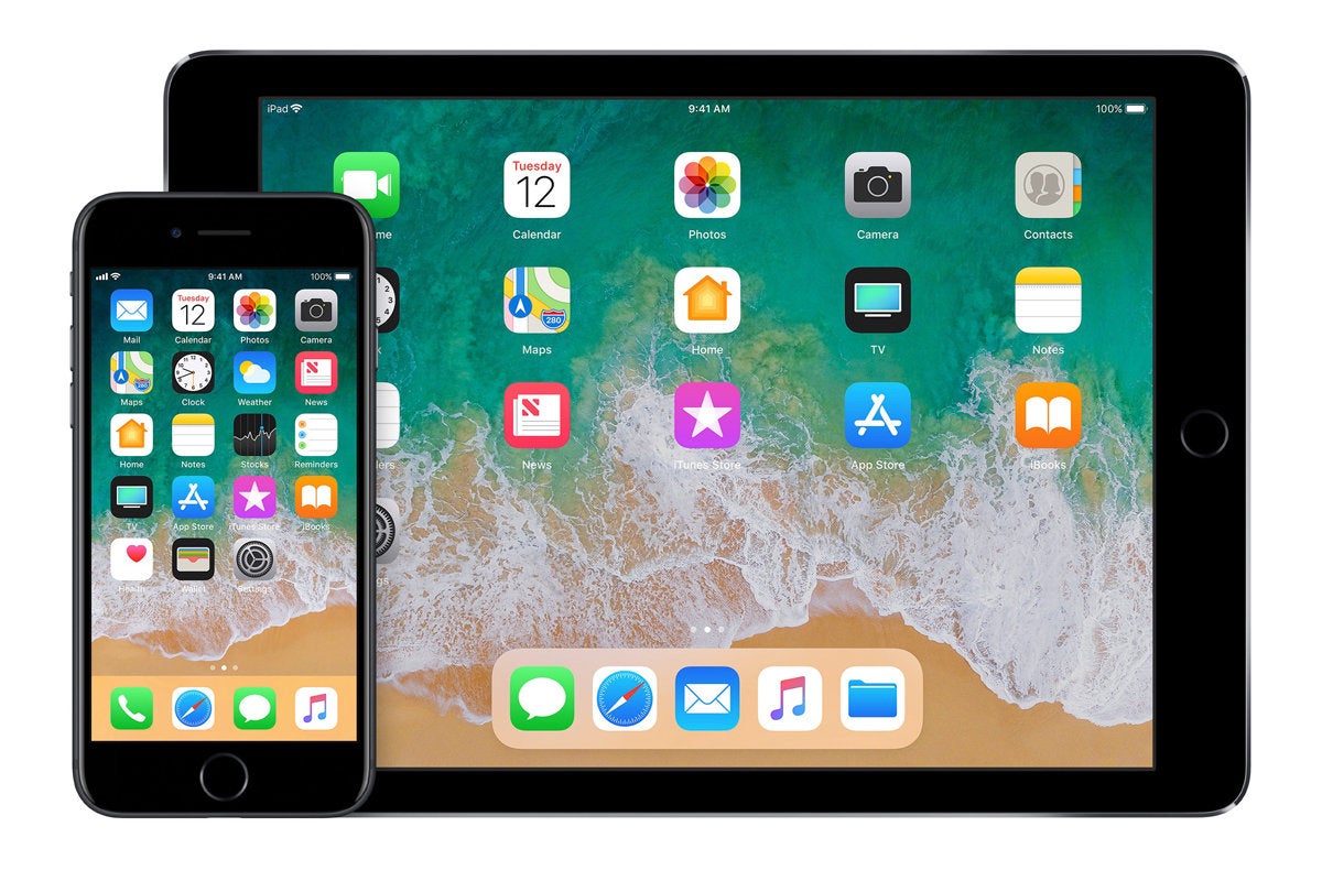
AppleCurrently, the iPad home screen is a version of the iPhone home screen. That’s a problem.
The big problem with the home screen is that it’s just a wide-spaced version of the iPhone version. There’s a lot of open space left for you to admire your wallpaper image, is what I’m saying. I’d like a new homescreen to pack information onto the iPad Pro’s 11- and 12.9-inch screens.
Yes, the home screen needs to be more than just apps—but the apps could be presented better. I’d like the option to place specific apps (or folders) on the main screen, while also having the option to view all the apps on the device in an alphabetical list. (Not every app installed on my device needs a place on my home screen.)
Still, there are limits to density. The iPad screen should be able to be uncluttered if someone wants it to be uncluttered. Density should be an option for people who want to add it—not a feature forced on everyone.
File access
One of the fundamental differences between iOS and macOS is the function of the device’s primary interface screen. On macOS, Finder is the center of the world—and it’s a file browser. On iOS, the home screen reigns supreme—and it’s an app browser. The difference matters.
On macOS, the Finder’s main function is as a file browser. On iOS, the home screen is an app browser.
But Gurman’s report mentions “improvements to file management,” and it made me think that perhaps it’s time for iOS to embrace files as well. If I’ve got a folder full of project documents, or a file server I connect to regularly, perhaps the home screen is a more appropriate place to access them than inside a separate app.
I think there’s something to this idea, but I do fear that it could go too far. I don’t want the iPad to just run a version of Finder. I do think the core iOS identity cracks a little bit if files move closer to the center of the user experience. Give me quick access to files and servers and cloud services, but I don’t need a tree of folders at the same level of priority as my favorite apps.
Widgets from Today view
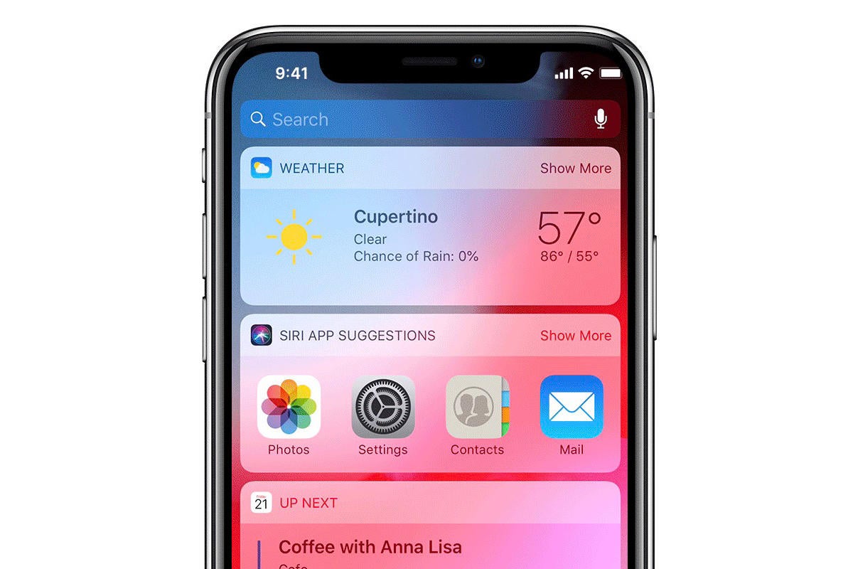
One of the most underappreciated aspects of iOS is the Today view, accessed by swiping from left to right on Notification Center. This view contains widgets from installed apps that can present live data and even miniature app interfaces. Apple’s Shortcuts app will even let you run interactive shortcuts right inside the widget interface. It’s pretty great.
 Apple
AppleThe Today view in iOS lets you access app widgets for quick access to information.
I’d love to have access to some of these widgets on the home screen itself, rather than having them hide multiple swipes away. Not only would this let people place a weather or sports widget right on their home screen, but it could provide quick access to specific features of apps without leaving the home screen. Imagine, for instance, tapping a To Do button and entering in a to-do list item without ever leaving the home screen.
A more visual status bar
iOS features a very limited status bar at the top of the screen, when compared with macOS. I wonder if there’s a way to extend the status information on the home screen, perhaps in a way that adds quicker access to Control Center and lets you more quickly interact with elements like brightness and volume controls, wireless toggles, and more. Maybe a future home screen features a bigger, more robust status bar that is just a bit more like the Mac menu bar and a bit less like the tiny sliver of information that lives at the top of an iPhone screen.
I don’t know how radical a makeover Apple’s planning for the iPad home screen, but I hope it will provide us with more than a new view into the same old collection of apps. I like my iPhone home screen to be simple, but it’s small. My iPad screen is bigger than the one on my MacBook—it deserves to host a home screen that’s got more functionality and density than the one the iPad has suffered with for its entire existence.
Recent Comments