Brydge, known for its line of keyboards for the iPad, recently debuted its newest keyboard, an updated model designed for Apple’s 2018 11 and 12.9-inch iPad Pro models. The new Brydge Pro has been highly anticipated by iPad owners who have used Brydge keyboards in the past and prefer the bulk-free Brydge keyboard style.
I’ve teamed up with MacRumors videographer Dan Barbera to review the Brydge Pro, so make sure to check out his hands-on video below to get a visual overview of the keyboard and read on for my own review.
Design
If you’re familiar with Brydge keyboards, the Brydge Pro features the same general design as past Brydge options. It is the least bulky of the third-party keyboards for the new iPad Pro models that I’ve used, and it’s my favorite third-party keyboard design by far.
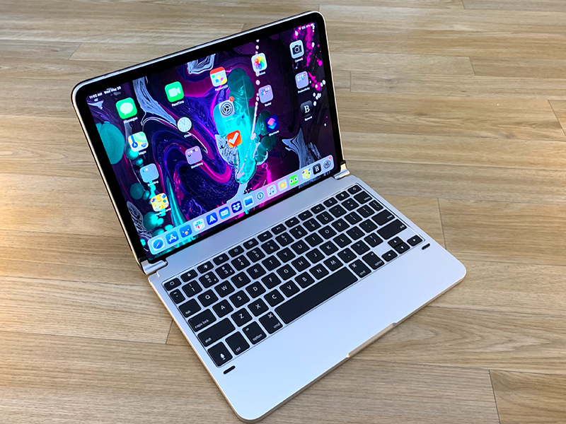
There are two rubber-lined hinged clips on the keyboard that your iPad Pro fits into, which hold it securely in place and mimic a MacBook setup. The clips move forwards and backwards so you can fold it up just like you would a laptop (and when you close it, there are little rubber nubs to prevent the keys from touching the display). Because of the rubber lining, the iPad Pro is secure and stable in the Brydge Pro, but I have noticed that the weight of the iPad Pro can cause to it flip backwards a bit when I pick it up using the keyboard portion.

The hinges are tighter than a MacBook hinge, but it’s still easy to open and close the keyboard and the iPad, and when you close it up, the iPad’s screen turns off. With the clips, there’s an adjustable 180 degree viewing angle, which is nice because it lets you position the iPad at whatever angle works best for you regardless of whether you’re typing on a flat surface like a desk or in your lap. On a desk, there are rubber feet at the bottom to keep it in place, which is a nice addition.

You can only rotate the clips a limited amount, so if you want to use your iPad in portrait mode, you’re going to need to take it out of the keyboard, which is a bit of a hassle. There’s no option to just fold it back, though I guess you could use it book style. You can pull the iPad out and stick it back in backwards to use the keyboard in tablet mode (folded back) or movie mode (no keyboard visible but iPad propped up) but it’s a hassle to have to take it out and put it in the clips.
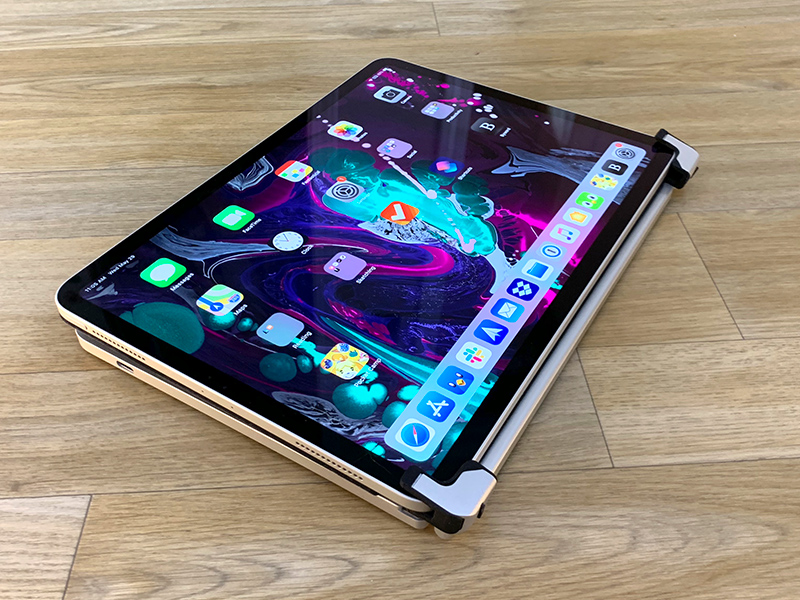
This isn’t a traditional folio style case, but there is a magnetic back cover that’s similar to a Smart Cover in both thickness and design. It’s meant to protect the back of the iPad when the keyboard is attached, and there are cutouts for the portion of the Brydge Pro that holds the iPad in place. Since this cover isn’t blocking the side of the iPad Pro, you can still attach and charge your Apple Pencil 2.

The Brydge Pro is made from aluminum and is available in either space gray or silver to match Apple’s iPads. It’s heavy and adds a good pound to the weight of the iPad, but I do appreciate that it’s much thinner than competing third-party keyboard options. Brydge says that it measures in at 15.6mm with the iPad Pro, compared to 22.5mm for the Logitech Slim Folio Pro.

I’ve noticed during daily use that when I open and close the Brydge Pro several times my iPad Pro has a tendency to scoot its way out of the clips a bit, which can be an irritation. On the whole, though, I love the design of the Brydge Pro because of the minimal bulk and because of the way it mimics a MacBook. I can’t tell you how many times I went to use the trackpad during this review because the Brydge Pro had such a MacBook vibe, but I did it a lot.

At one side of the Brydge Pro, there’s a single USB-C port, which is used for charging. You can check battery level on the keyboard itself using a battery button, but Brydge says you should only need to charge about once a year depending on how often you’re using the keyboard.
Keyboard
The keys on the Brydge Pro are soft and aren’t as satisfying to press as the keys on the Logitech Folio and they’re nowhere near as firm as the keys on a 2016 or later MacBook Pro, but it’s a better typing experience than the Smart Keyboard Folio from Apple, for the most part.
You know how Apple says butterfly keys are designed to be accurate and provide the same press no matter where you’re hitting the key? These keys on the Brydge Pro are the opposite. They’re squishy and don’t feel particularly stable to hit, so it’s not my favorite typing experience.

I had a hard time adjusting to the keys on the Brydge Pro, and I’m not entirely sure why. They’re soft and also quite small, which meant I wasn’t always hitting them accurately given the spacing between them, and at times, it almost felt like there was some lag that was resulting in missed key presses. Thankfully autocorrect mostly made up for it, but I needed to press harder on the keys than I’m used to in order to get my key presses to register accurately.
It took me about 15 minutes to figure out that I wasn’t experiencing lag, but needed to type in a more deliberate way with more force on each key and a more accurate press. I’ve never thought of myself as a light typer, but I guess using the MacBook Pro/iPad Pro Smart Keyboard Folio has taught me to use less force. I’m not a fan of the MacBook Pro keyboard in general due to its penchant for failure, but I have come to love the stable feel of the keys. The Brydge Pro is quite different from the MacBook Pro keyboard, which could be a plus for those who aren’t into the feel of the MacBook Pro keys.

I used the Brydge Pro to type this entire review and on the whole, I found it to be a frustrating experience until I got used to the amount of force the keys require and until I adjusted to the spacing between the keys. It’s still not an entirely comfortable experience for me because I’m so used to pressing more lightly on the MacBook Pro keyboard, but I was able to type at close to the same speed that I can get to with a keyboard I’m more accustomed to.
For those who have owned Brydge keyboards in the past, I don’t think the Brydge Pro is offering up the same typing experience. There are definite changes to key feel in this model.
I generally think that most people are going to be able to adjust to the Brydge Pro keyboard, but it’s possible that this is a key feel that isn’t going to suit everyone. Compared to something like the Logitech Folio Keyboard for the iPad Pro, I think the Brydge Pro’s keys aren’t quite as nice nor as immediately easy to adapt to.

There are a number of function row keys with special abilities when connected to an iOS device, such as options to get to the Home screen, adjust the brightness, bring up the onscreen keyboard, adjust volume, connect to Bluetooth devices, check battery level, and power the keyboard on and off.
This is a backlit keyboard, which is nice because that’s something that Apple’s Smart Keyboard Folio doesn’t offer. It’s just an on/off setting, though, with no way to adjust the brightness.
Bottom Line
I’m a huge fan of the design of the Brydge Pro, and though it’s still heavier than the Smart Keyboard Folio from Apple, it adds a lot less bulk than something like the Slim Folio Pro from Logitech or Zagg’s similar keyboard. It’s also easier to get off than these options, so you can keep it with you and pull it out only when you need it.
I’ve used Brydge keyboards in the past, and I’ve always thought they offered up the most MacBook-like experience out of any of the third-party keyboard options. I love that this version comes with a back cover to keep the iPad safe. It’s a great new update.

Unfortunately, the miss here for me is the keyboard. I just don’t like these keys. They’re too small and too soft, with too much spacing between them. I had a hard time adjusting to the feel of the keys and I made a lot of typing errors trying to get used to the amount of force and precision that I needed to type.
That said, other people may prefer the softer key feel and may not have the same adjustment issues because keyboard likes and dislikes vary a lot between people. I was still able to type at close to full speed, and I did eventually adjust and get a little better at it, but it’s never going to be my favorite keyboard when it comes to key feel.
Choosing between the Brydge Pro, the Smart Cover Folio from Apple, or something like the Slim Folio from Logitech is going to come down to personal preference. If you want the thinnest option, go with the Smart Cover Folio. Compared to other options, it’s whisper thin.
If you want the most MacBook-like experience with an amount of bulk that’s not overwhelming, choose the Brydge Pro. If you want the absolute best key feel out of the bunch and don’t mind the added size, choose the Logitech Slim Folio.
How to Buy
The Brydge Pro for iPad Pro can be pre-ordered from the Brydge website. The 11-inch model is priced at $149.99, while the 12.9-inch model is priced at $169.99.
Note: Brydge provided MacRumors with a Brydge Pro for the purpose of this review. No other compensation was received. MacRumors is an affiliate partner with Brydge. When you click a link and make a purchase, we may receive a small payment, which helps us keep the site running.
This article, "Review: The Brydge Pro Keyboard for iPad Offers a MacBook-Like Experience" first appeared on MacRumors.com
Discuss this article in our forums

Recent Comments