I’m daring to believe we’re living in one of the best years for the Mac in ages. A recent report from trusted analyst Ming-Chi Kuo brims with rumors regarding everything from a 16-inch MacBook Pro with an “all-new design” to a 31-inch 6K standalone Apple monitor. There may even be a 32GB upgrade for the 13-inch MacBook Pro, and it looks as though we’ll finally be getting the modular Mac Pro.
But it’s that “all-new design” that intrigues me the most. Kuo didn’t offer many specifics, so I’ve allowed my imagination and wishlist to run wild. For the most part, I’ve left out hardware upgrades—such as a better graphics card (like the Vega)—and focused on the general user experience. With these changes, I believe Apple could recapture some of the wonder the MacBook used to spark in years past.
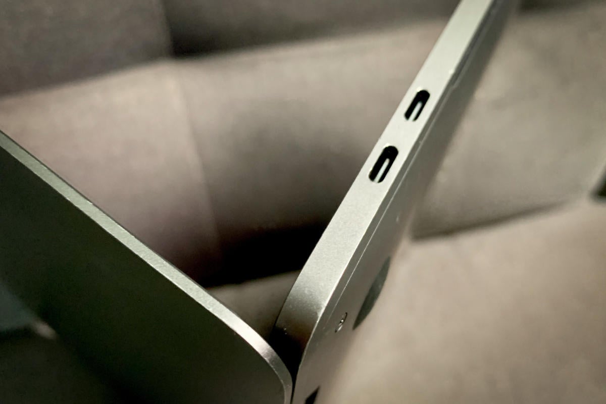
More ports! My kingdom for more ports!
I doubt we’ll ever see USB-A ports return to the MacBook (although, yes, I’d love to have at least one for emergencies). After all, USB-A is ancient; a relic from the days of CDs and flip phones. Apple is right to assume the versatile and smaller USB-C port should replace it, not least because you never have to worry about a USB-C cable being upside down when you try to plug it in.
 Leif Johnson
Would more ports make a new MacBook Pro more portly?
But at least give us more USB-C/Thunderbolt 3 ports. The mere two USB-C ports on both the 13-inch MacBook Pro and the new MacBook Air make it had for me to take them seriously as work machines. I tend to keep one of these ports stuffed with a power cable, and at the office, the spare port usually connects to an external Cinema Display. That means I need to unplug one of these whenever I want to use an SD card reader, wired mouse, or a wide range of other peripherals, and it’s maddening. That’s not “pro”—that’s a problem.
Three ports on all MacBooks would be an improvement. Since Apple is going big, let’s go ahead and wish for either a USB-A port or an SD card reader on the 16-inch Pro along with the four USB-C ports we’re familiar with from the 15-inch models.
Ditch the Touch Bar
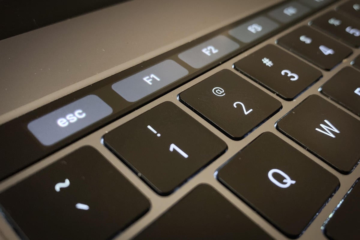
The Touch Bar is a nifty idea that sounds great on paper, but in practice it’s needless and distracting fluff. It’s innovation for the sake of innovation. In many cases it complicates workflows rather than simplifying them. Apple should kill it and give us the old setup with escape and function keys, and the latest MacBook Air suggests Apple may be comfortable that direction.
Apple should limit any future “touchscreen” elements to the Touch ID square we find on the MacBook Pro and MacBook Air keyboards, as it simplifies the act of logging in, entering passwords, and paying for apps.
 Leif Johnson
I didn’t even feel like resetting it for this photo.
I gave the Touch Bar a good go, but these days I keep it set to the digital F1-F12 keys. If Apple feels it needs to keep the Touch Bar, it should include both the Touch Bar and the function keys.
Face ID/TrueDepth sensors on the Mac
The latest iPad Pros have TrueDepth sensors and Face ID, and it’s easily my favorite new feature. It cuts out all kinds of delays you formerly had to endure before pressing the Home button while using the iPad in landscape mode, including payments, logons, and simply unlocking that machine.
The change wouldn’t be as extreme with the MacBook, but it would still streamline authentication beyond even the welcome addition of Touch ID on newer keyboards. It could also allow Mac users to use Animoji and Memoji in their Messages much as they do on their iPhone. As a side benefit, a TrueDepth sensor would simplify some tasks for 3D modelers.
Thinner bezels on the display
Speaking of the new iPad Pro, it’s hard to go back to using another device once you’ve gotten used to that lovely, bright display. Apple describes it with some hyperbole as “edge to edge,” but there’s no mistaking that it comes closer to matching that description than previous models.
That’s mainly because the bezels are thinner. I’d love it if Apple worked something like this design into the new MacBooks, particularly if it also mimic the iPad Pro by also including TrueDepth sensors without a notch.
While we’re at it, I wouldn’t mind an OLED display. But let’s not be greedy. Right now I’d settle for having Apple’s ProMotion technology from the iPad Pro on a MacBook so that all of us can enjoy faster refresh rates on our screens.
Apple Pencil support on the MacBook trackpad
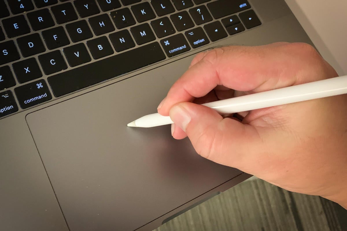
The Apple Pencil currently only works with the iPad Pro, but I see little reason why it can’t also work with the sprawling six-inch trackpads we already find on the 15-inch models (or, for that matter, the standalone Magic Trackpad). This setup probably wouldn’t fully replace a Wacom tablet for some creative pros, but it would be great to be able to open Adobe Photoshop and Illustrator and make quick corrections to sketches without the need to hook up extra peripherals.
 Leif Johnson
Seriously, that’s way more room than you’ll get in a Moleskine.
FIt could also be a way to attract creatives who may not want to spend $799 on an iPad Pro but wouldn’t mind spending $129 on an Apple Pencil for the Mac they likely already have. Even if you’re not an artist, this could be a useful feature for scribbling notes in Notability and similar apps.
If Apple isn’t going to go this route, it should shrink the trackpad on the larger models. I find the trackpad is the perfect size on my 12-inch MacBook, but it too often gets in my way on the 15-inch model.
A keyboard with better key travel
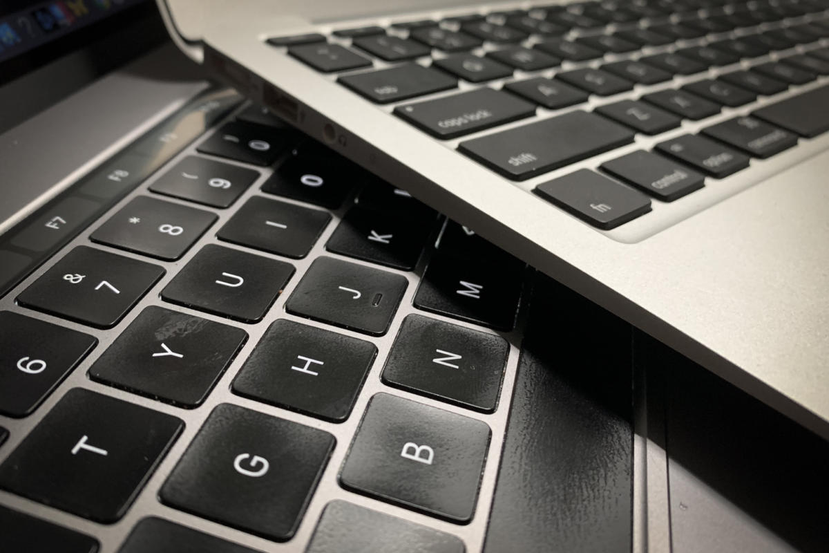
Almost any professional writer reports a twinge of pleasure when they place their fingers on the keys of pre-2015 MacBooks. They were springy and blessed with satisfying key travel; it felt like writing listicles on a grand piano. By comparison, the “butterfly” keyboards on the new Pros can make typing loud, brutal, and unsatisfying. I don’t hate the new keyboards as much as some folks—in fact, I love typing on the 12-inch MacBook—but there’s no mistaking the difference.
 Leif Johnson
And it’s quite the difference.
Apple needs to recapture some of that magic. If it won’t bring back the old keyboard, it should at least meet writers halfway with a hybrid model (and one that hopefully doesn’t cost a fortune to repair).
It’s not a stretch to say that journalists and writers in general are a key market for Apple, as it wasn’t too long ago that you could walk into any media junket and see the press room aglow with dozens of Apple logos. That’s less the case now, as more and more scribes are turning to Chromebooks and Windows laptops that offer a better typing experience than Apple. That’s a shame.
Bring back the glowing Apple logo
Was the old glowing Apple logo necessary? Nah. Did it add a degree of playfulness and wonder that we didn’t find in the bland machines cranked out by competitors? Heck, yeah.
Maybe Apple ditched it because it unnecessarily drained a MacBook’s battery life (although I can’t see it demanding much more juice than the Touch Bar). Maybe it worried that it warranted too many repairs when the lights fizzled out.
But that glowing fruit made MacBooks stand out in the best way. Not only did it look cool, it suggested that technology could lead us to a future that was bright, even hopeful. If Apple wants to stay close to the current design, it need only make the logo smaller.

Recent Comments